LoadingBar.js
LoadingBar.js is a highly flexible, open sourced progress bar library based on SVG.
Ease of Use
use it simply by adding a ldBar css class to create your own progress bar.
Rich Presets
various prebuilt styles of progress bar for you to choose, by simply adding a data-preset attribute.
data-preset="circle"data-preset="bubble"data-preset="line"data-preset="fan"Highly Configurable
You can use HTML attributes, Stylesheet or even JS API to customize it
...And is Small!
plus no external dependency. just in vanilla JS.
Installation
download loading bar JS and CSS files ( or, the zipped pack ) and include them in your HTML:
You can also clone the loadingBar.js Github repository and build the files by yourself.
Basic Usage
Create an element with ldBar class and set its value by data-value attribute:
By default, loadingBar.js will create a progress bar in the ldBar element for you. A corresponding ldBar JavaScript object is also created automatically and stored directly in this element, you can use the object to update bar's value with set method. Alternatively, you can use construct a new ldBar object constructor directly by passing the css selector:
new ldBar("#myItem1");
/* ldBar stored in the element */
var bar2 = document.getElementById('myItem1').ldBar;
bar1.set(60);
</script>now you have a progress bar with default style, showing 60% as its value:
Basic Styling
Progress bars in loadingBar.js are all responsive; you can use the css width and height properties to control its size. For example, this is a huge circular progres bar with width:50% :
Additionally, stroke-type progress bars are made with path elements, so you can also control their style with common svg / css attributes:
stroke-width: 10stroke-lincap: roundstroke: redElements for the base grid line and the progress bar are named with class "baseline" and "mainline" respectively. This is quite useful when you need advanced styling. Following example makes a decent circular progress bar with shadow by tickling with "mainline" and "baseline" classes:
Label Styling
In above example, we used a built-in class label-center to instruct ldBar to centralize the label:
However, you can do your own styling by tickling the "ldBar-label" class. Label of ldBar is in fact a HTML <div> tag with "ldBar-labal" class, so you can style it with CSS like this:
Custom Unit
Unit in label is by default "%" and controlled by the after pseudo element, so you can change it by tweaking the after pseudo element like this:
If somehow you can't use CSS to change unit, you can also specify data-unit attribute to customize unit; in this case the unit will be put in a span element inside .ldBar-label node:
Presets
Besides default progress bar, there are various presets in loadingBar for you to choose. To choose a preset, use the data-preset attribute:
Following are the built-in presets shipped along with loadingBar.js:
linefancirclebubblerainbowenergystripetextFurthermore, you can config and customize your loading bar even if you have specified data-preset attribute. We will cover this part in the folloing section.
Advanced Styling
You can adjust the appearance of progress bar by setting HTML attribute or passing the configuration into JS constructor. But at first, we should know that there are two kinds of progress bars:
Stroke Type- Progess grows along a SVG Path.Fill Type- Progess visualized by showing part of an image or SVG Shape.
Stroke Type Progress Bar
To use a stroke type progress bar, set data-type to "stroke" and customize your path by providing SVG Path command to the data-path attribute. Following example draws a sinle, horizontal line:
For a more complicated example, below we draw a heart with Adobe Illustrator ( left ) and save it as SVG ( right ):
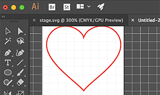
we can then use the path command ( red part ) in data-path attribute of our progress bar:
further tweaking is possible with following attributes:
| attr name | description |
|---|---|
| data-stroke | tweak stroke color or pattern |
| data-stroke-width | tweak stroke width |
| data-stroke-trail | tweak trail width color |
| data-stroke-trail-width | tweak trail width |
following examples show how to config with stroke and trail:
Note that alternatively you can style loading bar with CSS, as mentioned in previous section.
Fill Type Progress Bar
to use fill type progress bar, just set data-type attribute to "fill". loadingBar can fill either a path of an image, specified by data-path and data-img respectively:
Image Size
LoadingBar.js use the image size to initialize the progress bar, but if you need a different size, you can use data-image-size attribute to change its size:
Fill Direction
Direction of fill type progres bar is by default from left to right. To change this direction, use data-fill-dir:
there are 4 possible values for data-fill-dir attribute:
- btt - bottom to top
- ttb - top to bottom
- ltr - left to right
- rtl - right to left
Data Range
You can use alternative data range instead of 0 ~ 100 by data-min and data-max attributes. For example, following code generates a bar that is empty with value "59" / full with value "87":
Data Precision
LoadingBar.js rounds values by default, but you can use data-precision to control how values are rounded. To round to the fourth decimal places, use data-precision="0.0001":
Styling Background
We can also control the color and size of the base image with data-fill-background (for color) and data-fill-background-extrude (for size) attributes:
Pattern Generator
To make it easier to customize your progress bar, we provide generators for generating patterns including graident, stripe and bubbles. they can be used in data-path, data-fill and data-stroke. They are designed with a data-uri favor:
currently there are 3 types of pattern available:
- Gradient
- Bubble
- Stripe
Gradient Pattern
syntax:
example:
Bubble
syntax:
example:
Stripe
syntax:
example:
Custom Pattern Images
If the above generators don't fit your need, you can use your own pattern images. To use image to fill / stroke progress bar, simply put the image URL in data-fill / data-stroke attributes. For example, this progress bar is filled with a cloud animation:
While making animated patterns is not a trivial task, Loading.io provides a rich pattern library "Loading Patterns" for you to choose; here are some sample patterns from "loading patterns":
All patterns from loading.io are seamless repeatable and animatable and can still be generated in static form. Don't forget to take a look if there is anything you need.
Go to Loading PatternsPattern Sizing
You can specify the pattern size with data-pattern-size attribute to make pattern bigger or smaller:
Some examples of different pattern size:
JS API
You can use JavaScript to initialize a progress bar:
All options are HTML attribute counterpart without data- prefix. For example, following script create a red, fan type progress bar:
To update bar's value, simply use set method will do:
Reference
Here is a complete list of all configurations for loading bars.
| name | description |
|---|---|
| data-type | set the progress type. can be stroke or fill. |
| data-fill-dir | growth direction of fill type progress bar. possible value:
|
| data-stroke-dir | growth direction of stroke type progress bar. possible value: normal / reverse |
| data-img | image of fill type progress bar. could be a file name or data URI. |
| data-path | SVG Path command, such as M10 10L90 10. used both in stroke and fill type progress bar. |
| data-fill | fill color, pattern or image when using a fill type progress bar with custom data-path. could be image, generated patterns or colors. |
| data-fill-background | fill color of the background shape in fill type progress bar. |
| data-fill-background-extrude | size of the background shape in fill type progress bar. |
| data-stroke | stroke color or pattern. |
| data-stroke-width | stroke width of the progress bar. |
| data-stroke-trail | trail color. |
| data-stroke-trail-width | trail width. |
| data-pattern-size | specify pattern size; e.g., 100 |
| data-img-size | specify image size; e.g., 200,100 |
| data-min | minimal value |
| data-max | maximal value |
| data-precision | control how values are rounded. e.g., "0.01" rounds values to second decimal place. |
| data-duration | bar animation duration. |
| data-transition-in | animate the bar for entering transition, when value is set by data-value. |
Browser Compatibility
tl;dr - Support Modern Browsers and IE >= 10
LoadingBar.js is based on several nowaday web technologies supported by modern browsers except IE.
- Progress Bar Transition - based on CSS Transition and SVG filter ( IE >= 10 )
- Customized Path - based on SVG ( IE >= 9 )
- (Optional) Animated Patterns ( such as bubbles ) - based on SMIL ( not supported in IE / Edge )
SMIL can help keep complicated animation minimized and the patterns still look ok in IE without animation, so you can consider using them even you want to support IE >= 10. otherwise, use your own GIF for IE>=10 compatibility in animated fill patterns.
License
This project is released under MIT License; check out our Github Repo for more information.
Comments
Any questions or suggestion? Feel free to leave comment here. :)
 / 見聞科技有限公司 VAT No. 52518929